IBM Client: Bank of Montreal
Refining BMO’s Sign-In Flows for Mobile & Web
User Flows & Interaction Design
Mobile App & Web platform
BMO ranked #1 in Customer Satisfaction with Online Banking by J.D.Power in 2023

IBM Client: Bank of Montreal
User Flows & Interaction Design
Mobile App & Web platform
BMO ranked #1 in Customer Satisfaction with Online Banking by J.D.Power in 2023
Bank of Montreal
Secure Retail Banking Team
Jan - Apr 2022
5 months
Product Designer • Led designs for the mobile and desktop sign-in flows. Collaborated with stakeholders to create a seamless cross-platform experience.
• Designers
• Product Owner
• Developers
• Business Analysts
• Accessibility SME
• Content writer
Revamp BMO’s online banking sign-in experience to create a unified, user-friendly interface across both mobile and desktop platforms
1.
The project is built on a single code base, ensuring a seamless and consistent design across mobile and desktop platforms.
2.
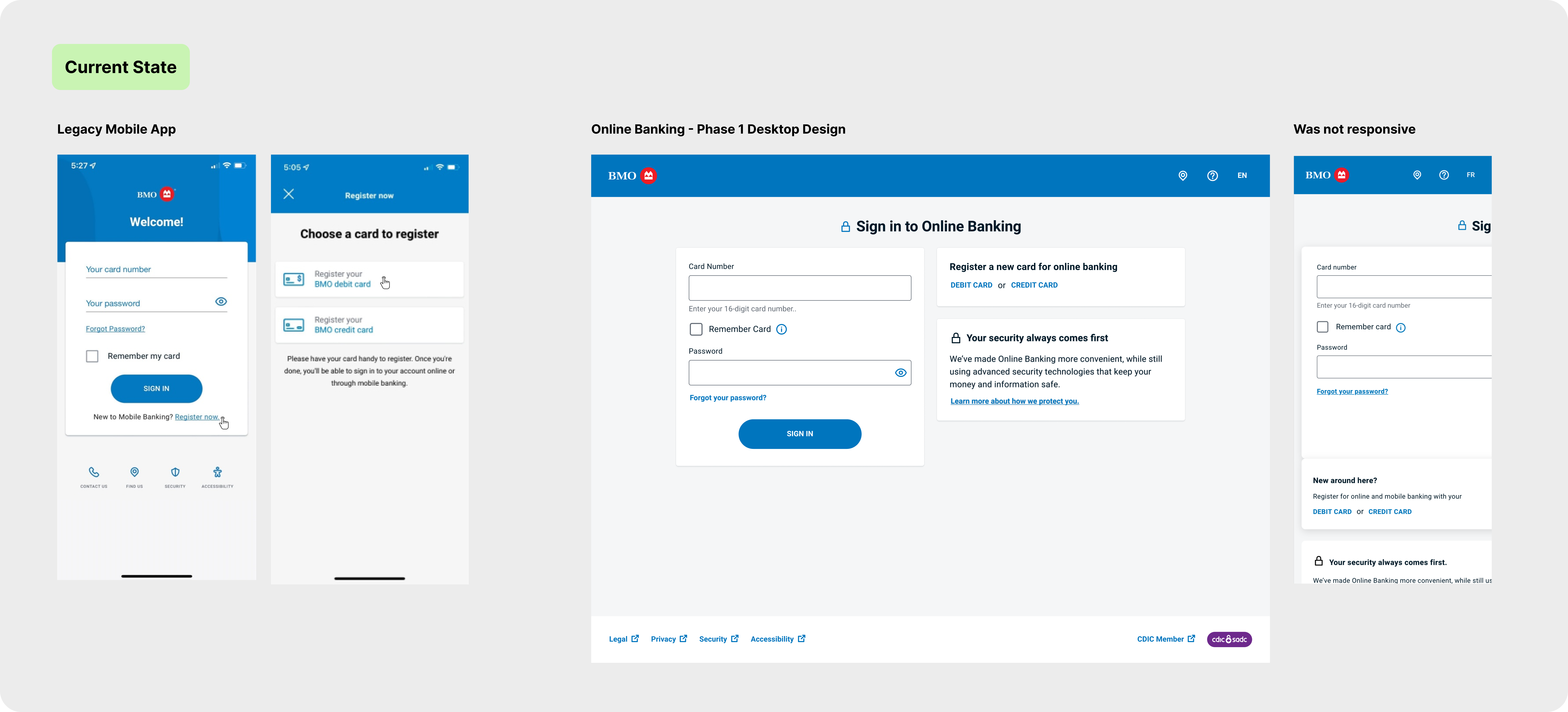
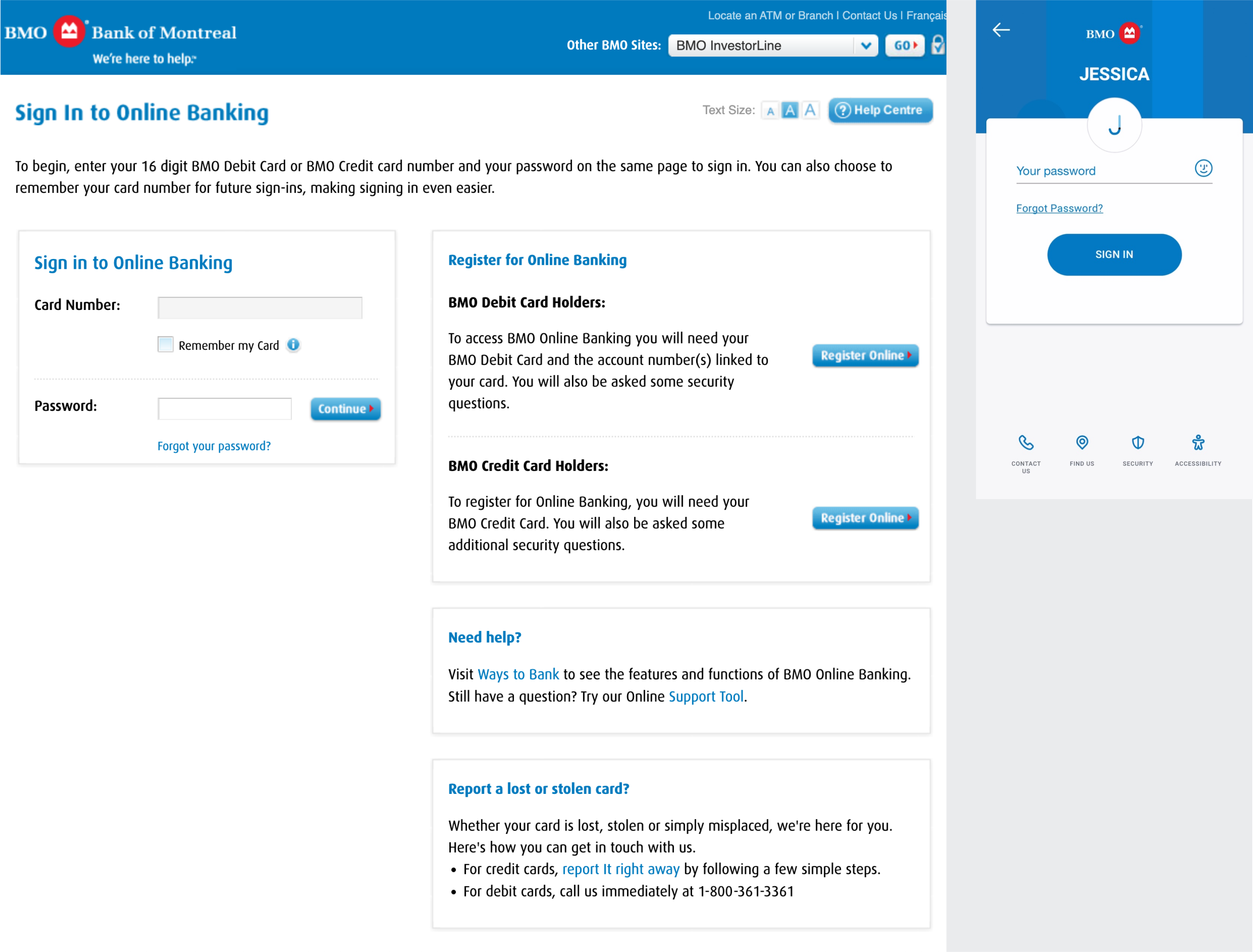
Revamped Desktop designs were completed in Phase 1 by another agency, providing a foundational starting point.
3.
BMO shifted from Sketch to Figma, and all Phase 1 designs needed to be moved over as well.
4.
Heavy emphasis on accessibility to cater to a diverse user base.
The project aimed to deliver a cohesive and accessible sign-in experience that improved user satisfaction and streamlined authentication processes across BMO’s digital platforms.
Here is an overview of the general process I followed end to end. It involved weekly stakeholder reviews and frequent cross-collaboration touchpoints with stakeholders.
After receiving the business scope, I conducted a current state analysis of the sign-in flows for the legacy mobile app and current web experience.
This analysis detailed the entire flow, including edge cases, to support discussions with developers and stakeholders on retaining existing functionality and identifying areas for improvement.
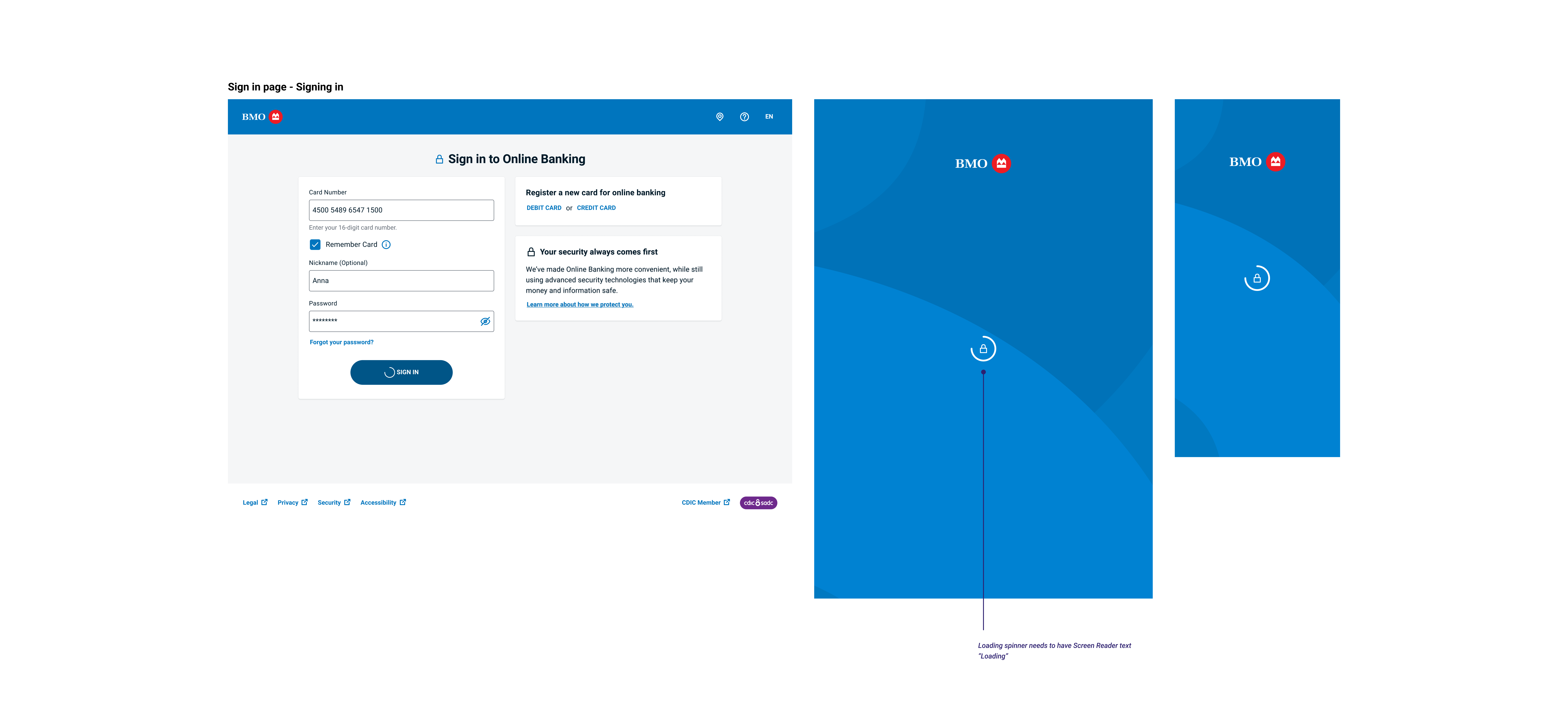
The following is an example of one flow—a process I repeated for all other major flows, such as sign-in with saved information, biometric sign-in, card management, and password recovery.
Following in-depth discussions with developers and stakeholders on the current state of a specific sign-in flow, I summarized the feedback and began mapping out the future state. This diagram was continuously updated as I refined each flow individually.
Given the goal of a streamlined cross-platform experience, the flow is largely consistent between the mobile app and web platform, with certain mobile-specific features highlighted. Additionally, the diagram includes edge cases, validation rules, and error scenarios alongside the happy path.

Extensive cross-referencing and time spent finding the right point of contacts for documents to understand the current state.
Barriers:
• Legacy team disbanded
• No testing environment access
• Lead Designer on BMO just resigned
Solutions:
• Reference any old designs I could find
• Used a friend's BMO account to understand current behaviour

As this was my first BMO project, I needed to familiarized myself with the product space. Learning banking acronyms and related projects that impacted the sign-in flow. I also noticed my colleagues were newer to the project as well.
Solutions:
• Create a Figma file that documents my learnings & a list of important links and contacts for the project
• Sharing this document with colleagues
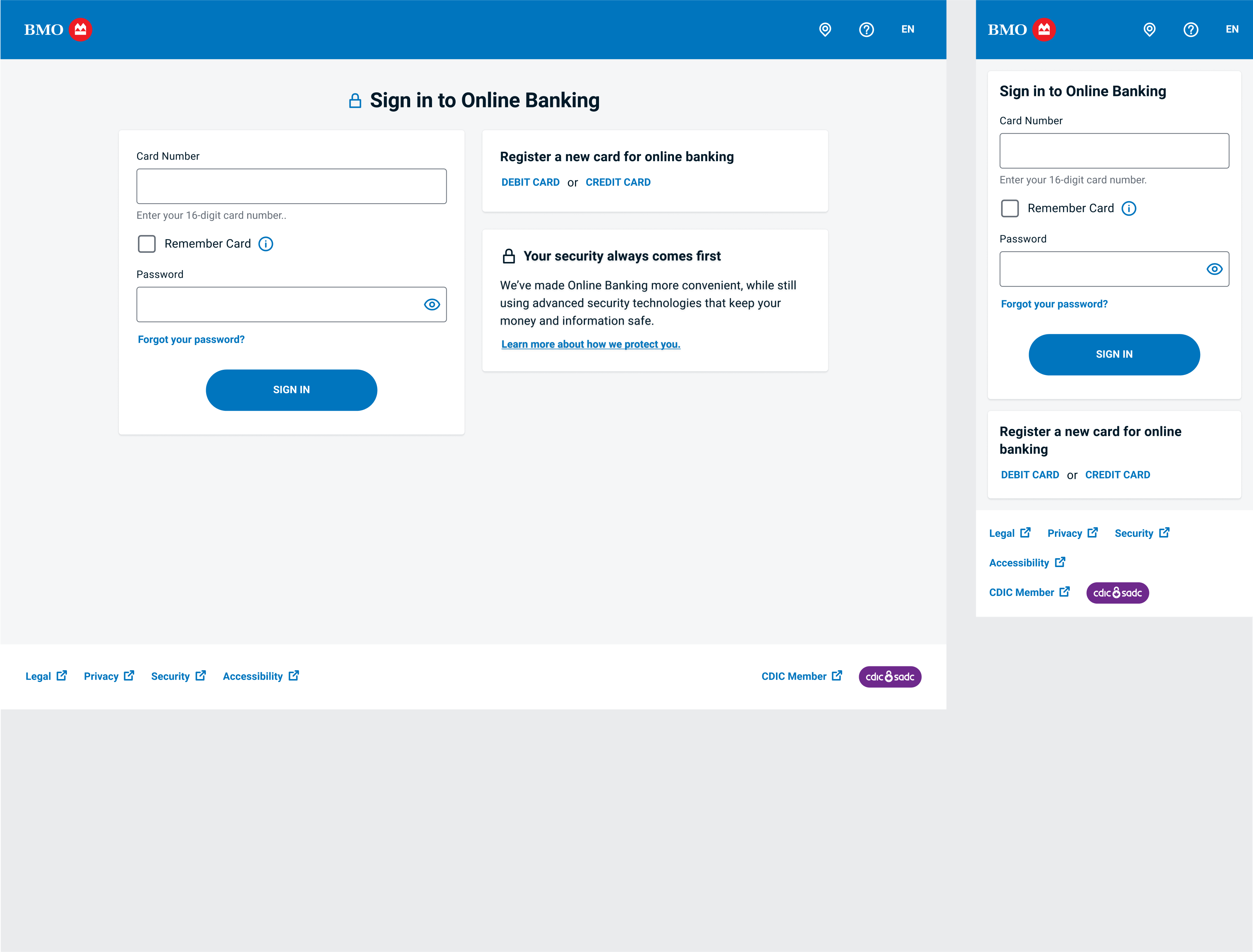
With a clear understanding of the future state flow and a reference to the current designs, I began drafting the new sign-in flows, starting with the happy path for first-time users.
Leveraging existing components from the BMO design system, I moved directly to medium-high fidelity, making this the most time-efficient approach.
Every week, I presented designs to a group of stakeholders, including developers, the product owner, the business analyst (BA), the accessibility expert, and content writer.
These sessions allowed us to address technical limitations and align on accessibility, content, and UX improvements.
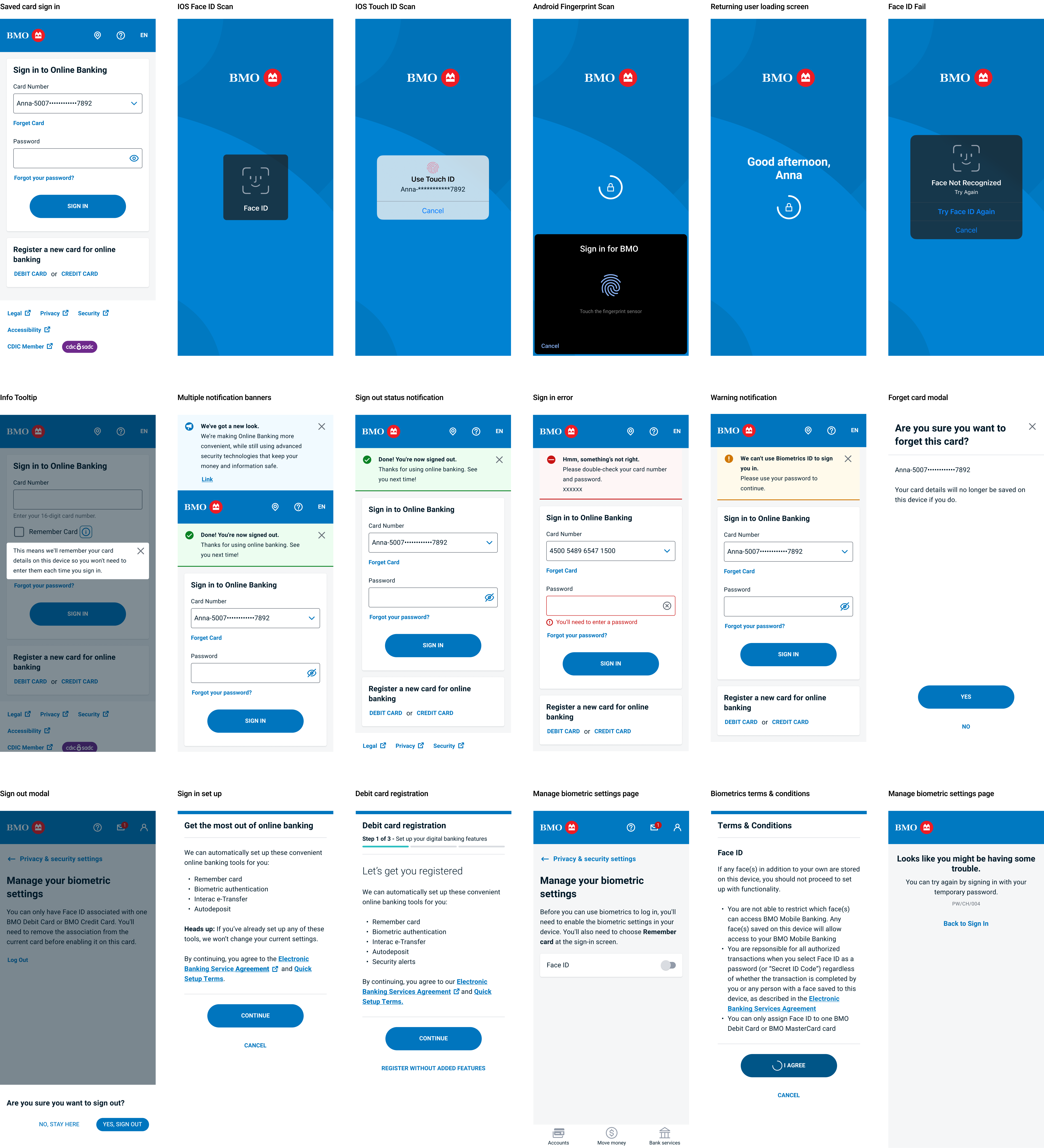
Primary designer for the following key flows:
• First Time Sign in
• Special Sign in setups
• Saved Sign in
• Temporary Password Sign in
• Managing Saved Accounts
• Biometric Set up
• Sign in with Biometrics for IOS, Android, and Samsung
• Managing Biometric Setting
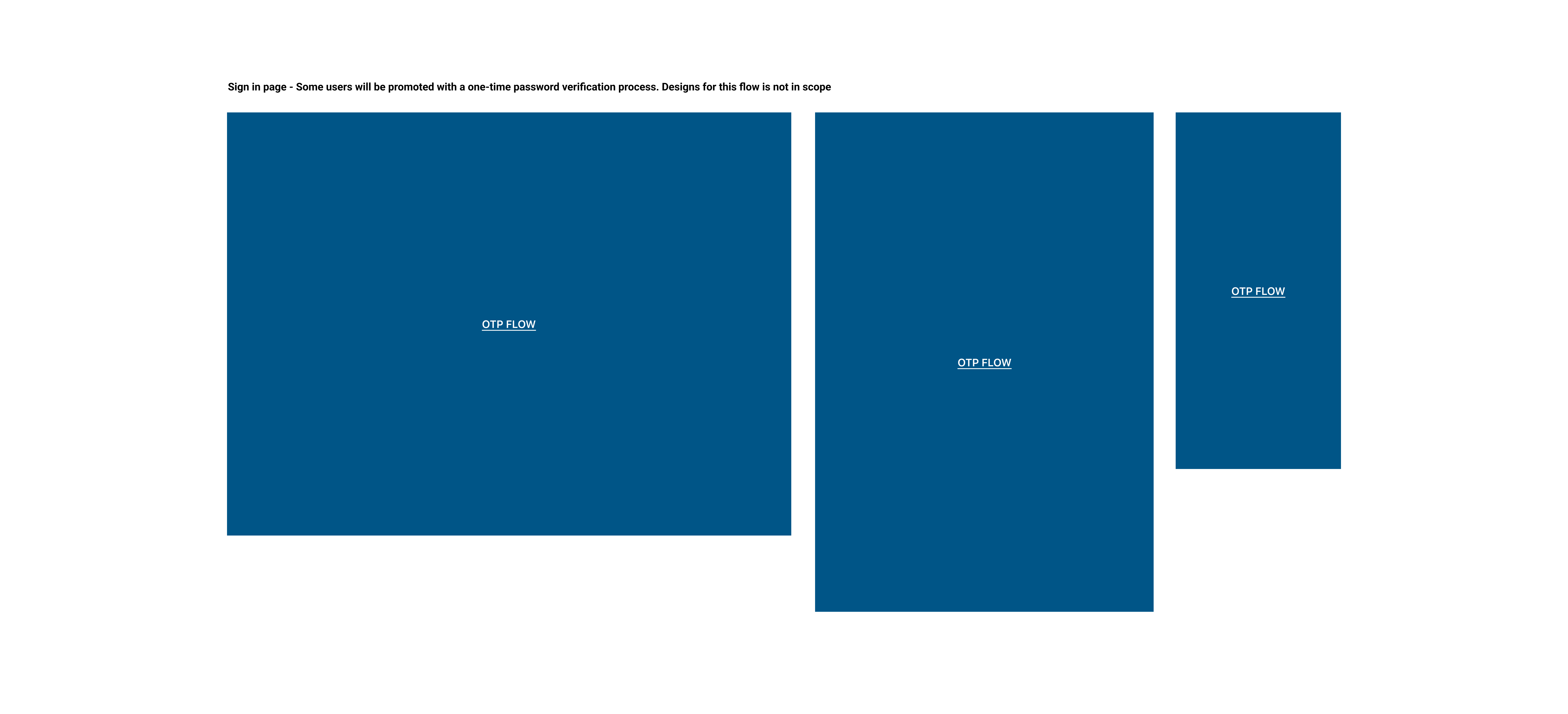
Due to the extensive number of flows and features I worked on, I will only highlight two examples of design changes. These examples illustrate how team discussions led to enhancements in user experience while aligning with business and technical requirements.

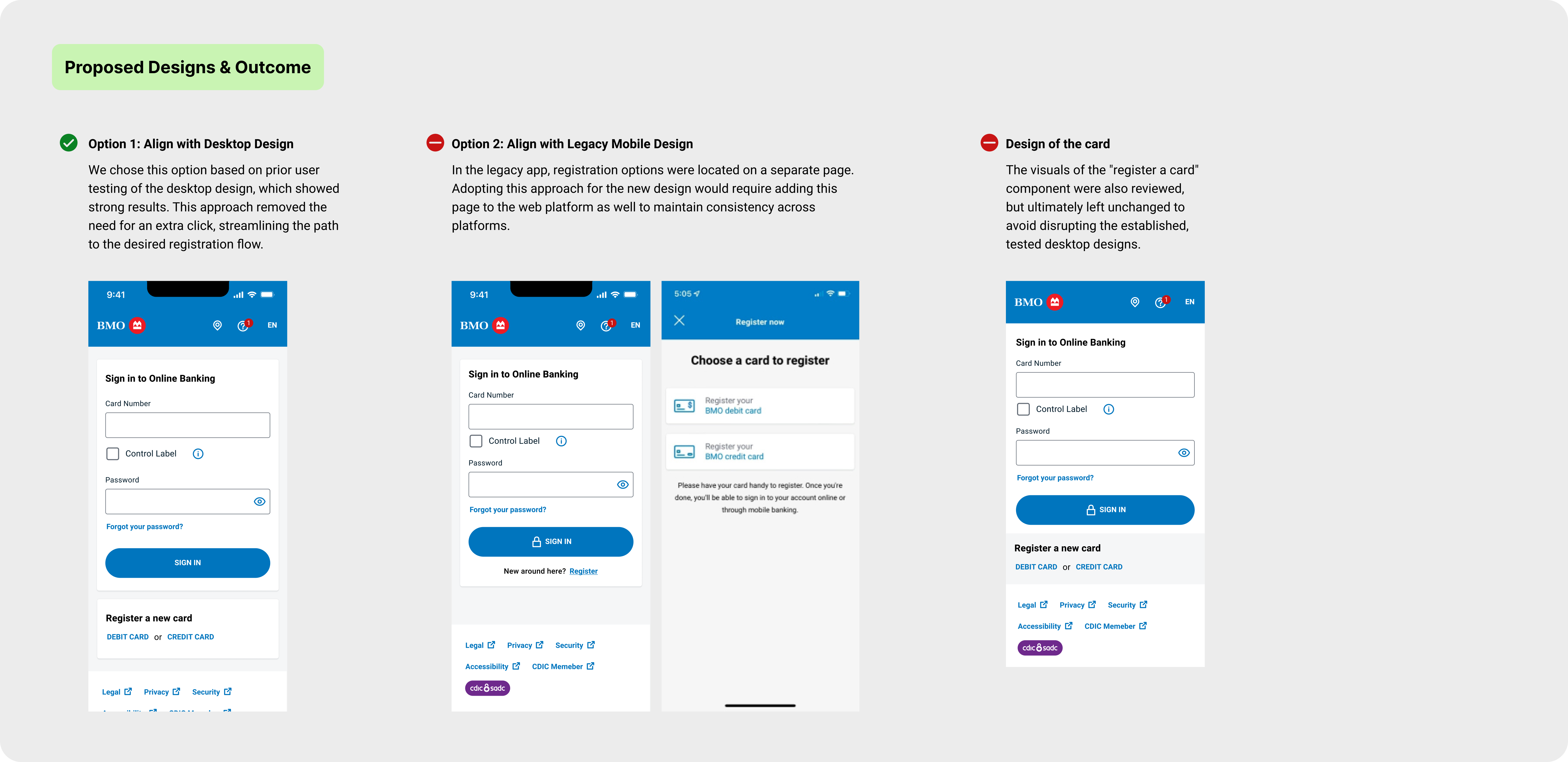
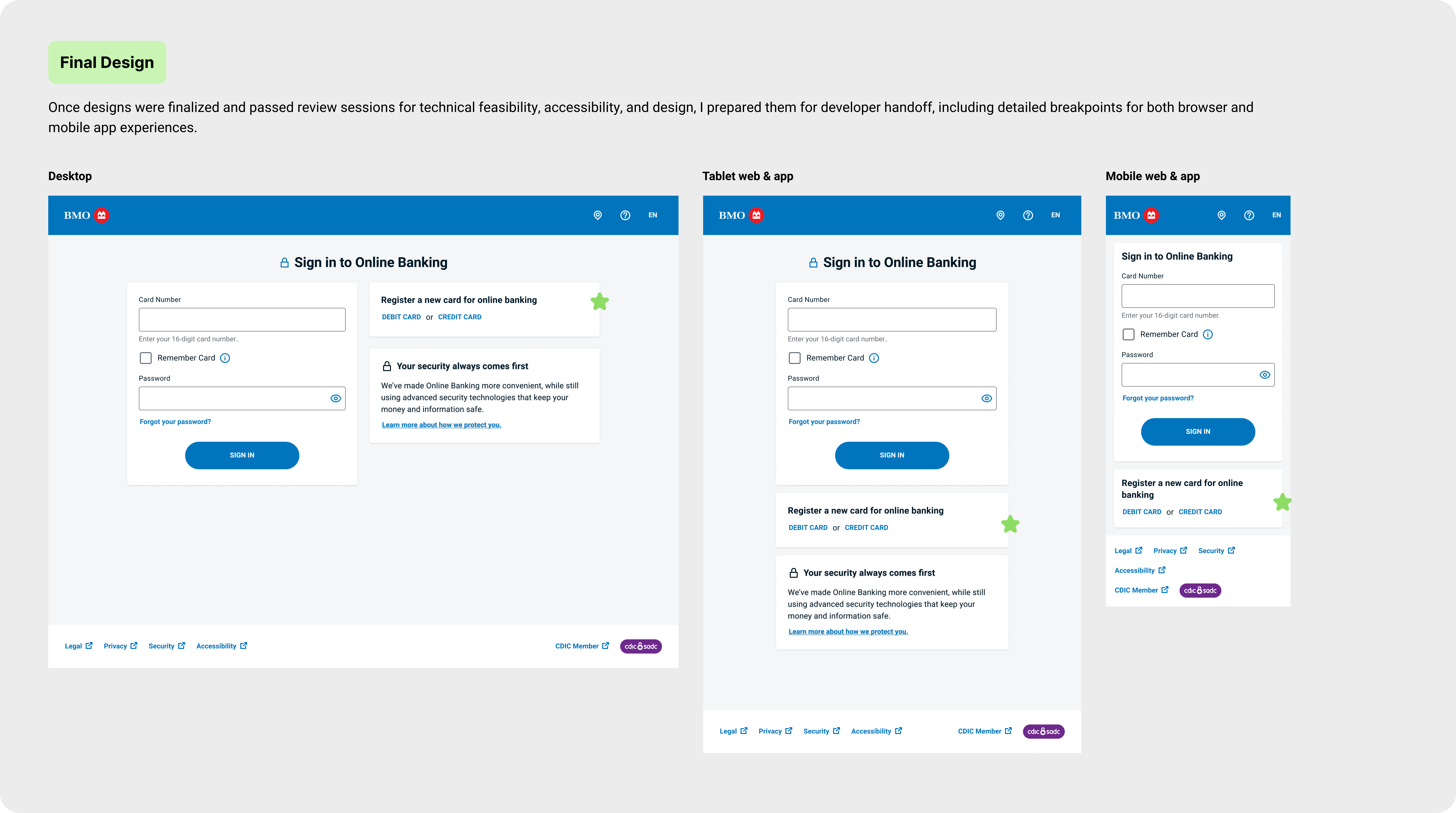
I noticed a discrepancy in the registration entry point between the app and web, so I raised this with the team. Here, I showcase my approach to addressing it.
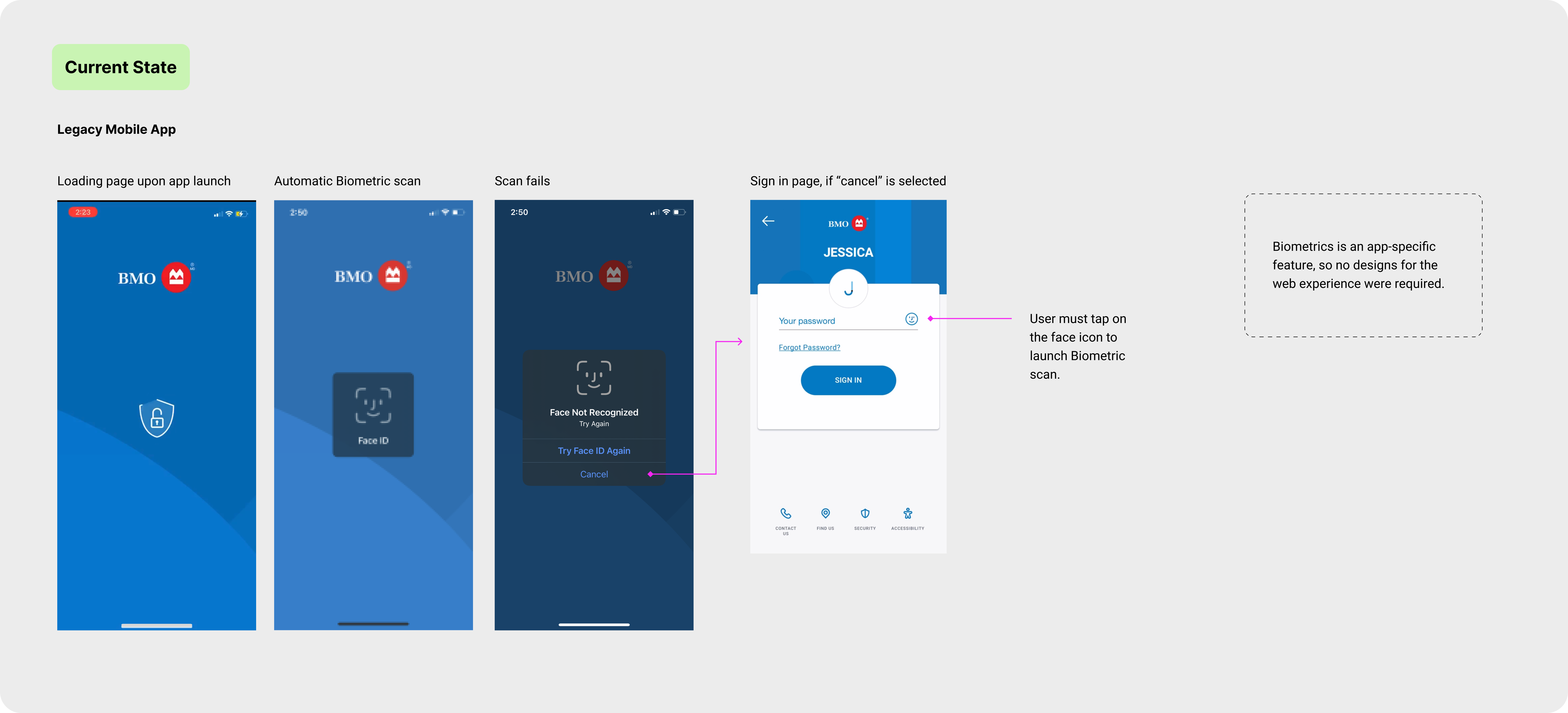
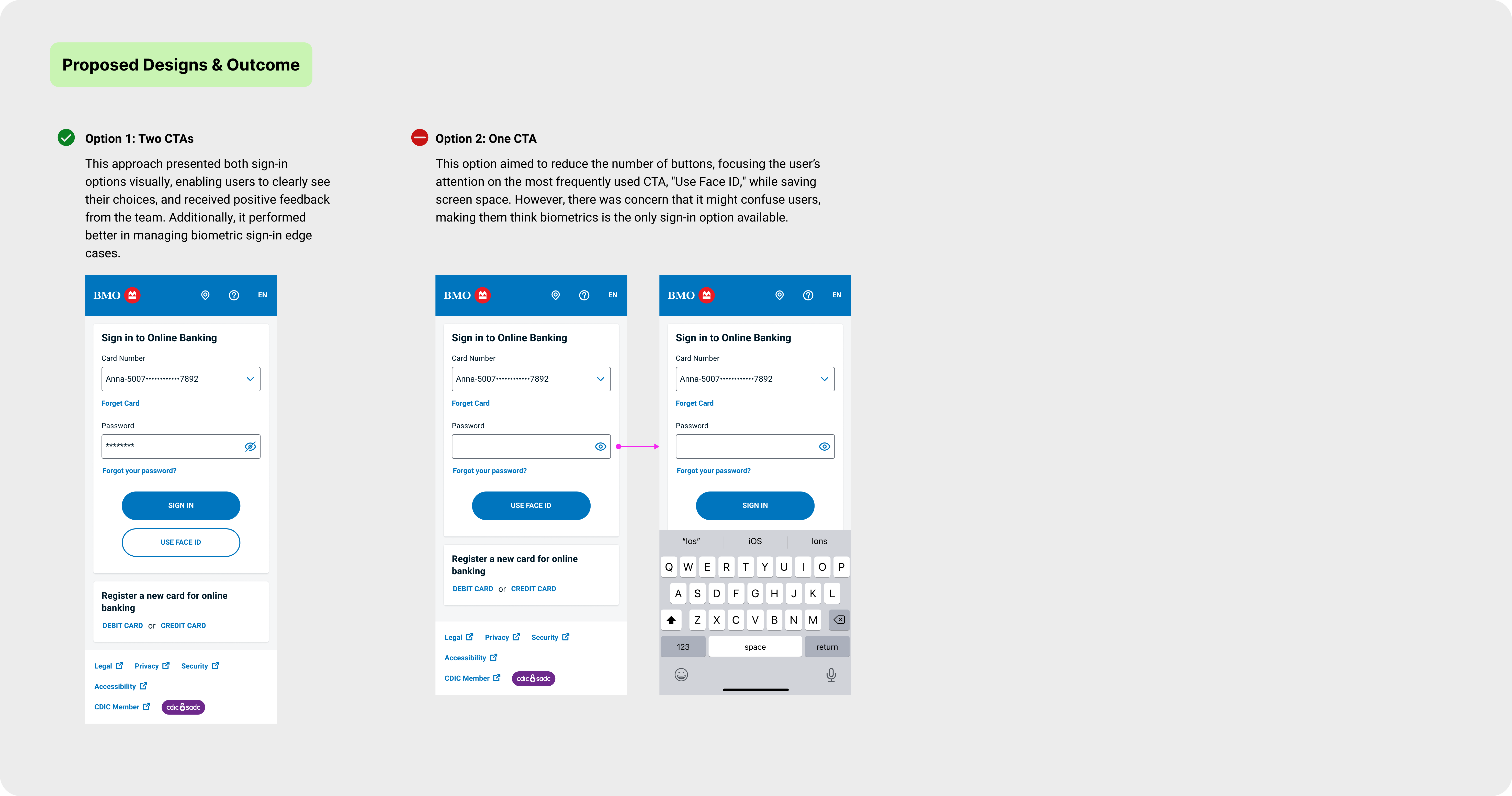
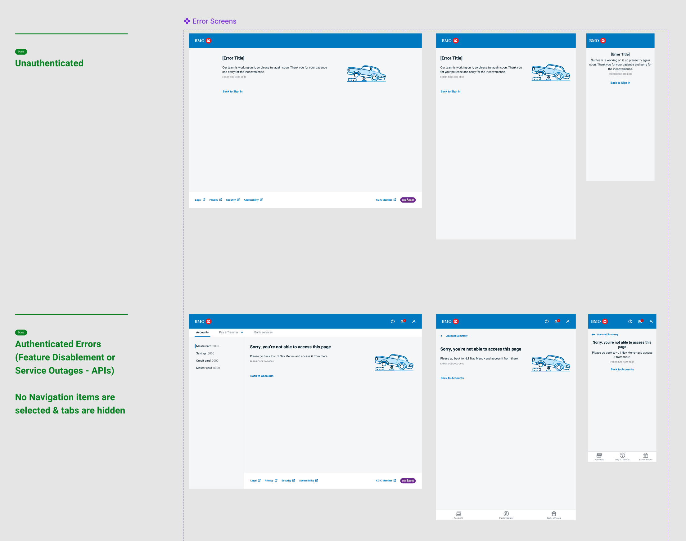
This design addresses the edge case scenario where a user has failed their biometric sign-in attempt. Even if they still have biometric attempts remaining, if the user decides to return to the sign-in page, this design outlines the expected flow for re-triggering the biometric scan.
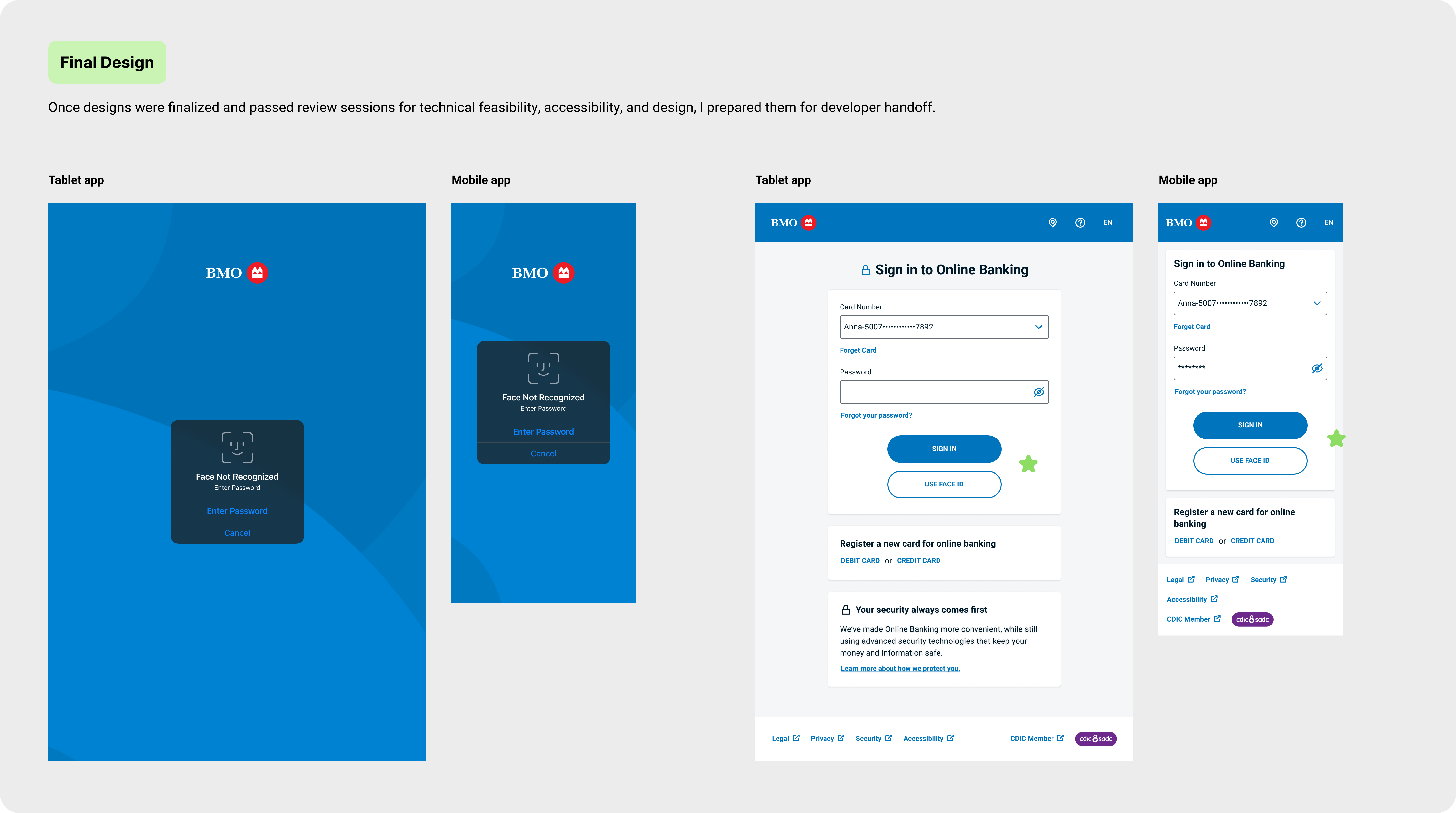
Through multiple sprints, the authentication flows for BMO's new retail banking experience were successfully completed and prepared for deployment. While the sign-in flow appears straightforward, extensive discussions and considerations took place behind the scenes to address all possible edge cases. After all, the sign-in experience is crucial, as it sets the tone for the entire user journey and forms the first impression of the banking experience.
With approximately 80 unique flows handed off, I'll only be highlighting the happy path of the Biometric Sign In below.

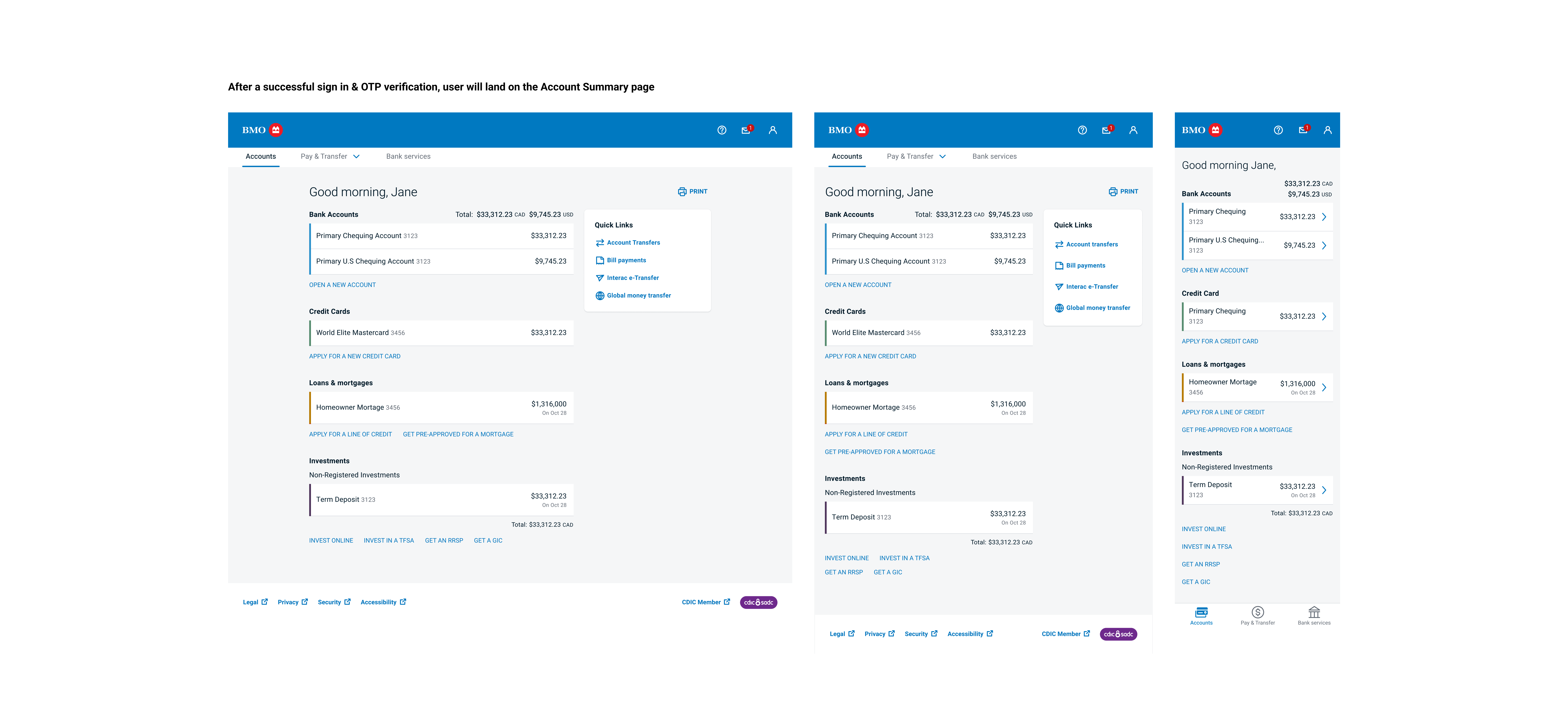
Other screen designs samples
The authentication flows were one of the key epics I led as part of the larger initiative to revamp the entire Online Banking experience. Following a similar design and collaboration process, I also designed the Credit Card Account Summary page, Investment Account page, Mobile Cheque Deposit, and Apple/Google Pay features.
The soft launch of BMO's refreshed Online Banking Experience took place in July 2022 and the full launch in September 2022. Although I had moved on from the project before the launch, I later received an email from the Director of Design for Secure Retail Banking, confirming that the new experience was performing exceptionally well. In fact, BMO was ranked first in customer satisfaction for online banking in the J.D. Power 2023 Canada Online Banking Satisfaction Study. Based on information/content, navigation, speed and visual appeal.

Documentation is Key
In a large organization like Bank of Montreal, it’s easy for documentation to get misplaced or for product knowledge to be lost due to inadequate knowledge transfer. To address this, I made it a priority to document all my design decisions in a design decision log within each Figma file. This ensures that the next designer working on the project can fully understand past decisions and access relevant Confluence page links or related research.
Value of effective Collaboration
Learned the value of effective collaboration with developers, product owners, and other stakeholders to ensure that design decisions met technical, accessibility, and business requirements.
Cross-Platform Design Challenges
Gained insight into the complexities of creating a unified user experience across mobile and desktop platforms. While maintaining consistency was a priority, I discovered that enhancing the mobile app's user experience often required additional interactions. At times, it was inevitable while other times, we had to ensure we didn't diverge too much from the web platform experience.